PowerPoint Templates
Green bar.
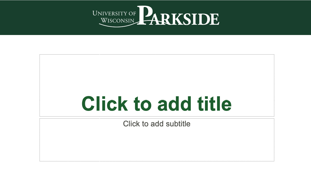
Green Bar PowerPoint template. Contains four styles: white with a bottom or top bar and green with a top or bottom bar and the University of Wisconsin-Parkside logo -- as shown below.
Note: You should use 16:9 ratio. Please do not create presentations in the outdated 4:3 ratio.


POWERPOINT SLIDE TIPS
Don’t overload. Every word you say should not be in the presentation. Your slides illustrate your presentation and should not be approached as a stand-alone document. Avoid using paragraphs – glean the main points for your audience. An alternative to overfilling a slide is to create a new, additional slide.
Text and font. Use a sanserif font aligned to the left in a size no smaller than 18 pt for greatest readability.
Images. Use high-quality photos that are simple in composition, so as to not compete with the text on your slide. Make sure they are not an unnecessary distraction – in other words, just because your slide is about cars, doesn’t mean you need an image of cars.
Charts vs. tables. In general, charts read better than tables for presenting data.
Sound and animation. Avoid unnecessary sounds and animations. Transitions should be smooth and elegant, not the feature of your presentation.